Remaining on the subject of CG landmarks (Star Wars IV), I thought I would mention the first use of CG in a music video. I am a fan of the band Dire Straits myself, so I was surprised to discover that their 1985 music video for 'Money For Nothing' is very significant in the history of computer generated imagery.
It is noticeable that the 3D technology here is very limited. The CG characters in the video consist of very few polygons, making them appear very square and un-detailed. Also their movements are very slow and rigid, and lack the expressive squash and stretch element that many 3D animators use today to create fluidity in the movement of objects. Not to take anything away from this video, at this time in the 80s human characters conveying emotion where only beginning to appear in features such as 'Adventures of Andre and Wally B' and 'Tony De Peltrie.' Although these characters are much more rigid than many in the features being produced by studios like Pixar and Dreamworks, the introduction of CG in to a music video must have been ground breaking at the time as music appeals to such a global market. The possibility of creating computer generated characters would have been seen by so many, and I do not doubt that a higher level of interest towards CG was generated.
Thursday, 29 December 2011
Wednesday, 28 December 2011
Early CG in Star Wars IV
As I have recently been re-watching the original Star Wars trilogy, I thought I would write a post about the first use of three dimensional CG wireframe model rendering in film. It is fascinating to think that a 1970s computer had the capacity to create 3D models. We seen in the video that the creator of the sequence, Larry Cuba, was still working with dials to control and navigate around his work. It is humorous to note the time between each click when he uses his graphics tablet. Clearly the equipment he is using is not very responsive in comparison to the computers around today. Everything about this process is tedious and time consuming. He explains that he 'wrote a program' to combine the six trench modules to create the whole structure. He also describes the stop motion-esque method of recording the trench run simulation. It took 2000 exposures to show the approach toward the Death Star and through the trench. Just the thought of this drawn out method causes me to cringe. In programs today like Maya along with much faster computers, 3D models and animations can be created with ease. A playblast to preview an animation takes only seconds to be converted into a quicktime movie. Seeing methods such as this really helps one appreciate the evolution of 3D animation. The software and machines around today are highly advanced in comparison to the tools used by Larry Cuba, and it is hard to comprehend how much the tools for a 3D animator will improve in the future.
Monday, 26 December 2011
Martin Asbury
As I am creating the storyboard for our group project, I have done some research on Martin Asbury. He is a comic book artist and also a storyboard artist. Because he creates comics, his storyboards reflect a certain over-exaggerated cartoon style. This in my opinion, although may not fully reflect the final polished result in the movie, helps convey the full emotion of each shot. We get a clear indication of each movement of the camera and actors withing the frame as everything is fully emphasized. Take this page from the storyboard he produced for 'Harry Potter and the Deathly Hallows.' He uses markings that reflect movement to really stress the action in each frame, such as the smashing of the chair:


Although not in the same league as this great looking story board, I believe I can relate more to this style with my storyboard work. Realistically, the purpose of a storyboard should be to aid the director so he can set up each shot confidently and with the finished results in his head beforehand. Because of Asbury's quick cartoon like style, he can spend less time trying to draw everything perfectly, but really highlight how each shot will feel and be composed.
Jurassic Park Before and After
Following up on my post about Spielberg's choice to switch from Go motion to CG in Jurassic Park, I found another interesting video. Although I praised the advanced stop motion technology which Spielberg originally planned to use, I do believe the CG effects in Jurassic Park still exceed many of the films out today. This video shows the process of placing in computer models and green screen actors in to some of the shots in the movie:
What is perhaps the most fascinating and also relevant part of this process, is the attention to detail when placing the CG creatures in to a live well lit environment. We can see in the 'First Sight' segment, the body of water was 'painted' in separately and then 'prepped' to take the reflections of the dinosaurs basking in the small lake. I would also be keen to find out what a 'heat map is' as apparently one is used for this particular shot. The 'T-Rex Vs Car' scene also gives us a look at the rigging inside of the T-Rex model, as well as the 3D car model, which I always assumed to be real. Even the actors are absent from the initial scene and apparently were placed in later, which shows the extend of polished modern techniques where everything is slotted together in post production. Building further on responding to real lighting conditions, we also see various 'shadow elements being placed into the scenes. For the 'In the Kitchen' segment we really get to see CG models responding to live actors in the scene. My favorite shot is at 3:50, where the boy is hiding from a raptor lurking just around the corner. The movement of the raptors head as it swings over the top of the kitchen surface creates a huge amount of tension, and leaves you at the edge of your seat.
Overall, this video shows how 3D modelling and animation comes in to film, and can be used in unison with live actors and lighting conditions. It shows how you can create realistic shadow elements and reflections to really place a CG model in to a real world.
Thursday, 22 December 2011
The Sound of Skyrim
As I have been given the task of producing sounds for our group film project, I have been conducting some research. I came across Mark Lampert, who was the 'Art Studio/ Sound Design guy' on Elder scrolls V Skyrim. This video shows how he created some of the sounds found in the game:
I find it interesting when Lampert talks about the 'Dwarven Sphere.' He layered up different sounds to achieve a very full and rich finished result. The mix of high and low frequency sound gives the machine-like creature depth and adds a great sense of realism. It's also interesting how he uses many physical objects to find different sounds. He explains how he used a small iron puzzle to find the high end sound for the Dwarven Sphere that suggests intricate mechanical movement. Perhaps when I am creating the sounds for our project, I could capture household objects to be layered up in order to create very interesting and unique results. I must also consider the depth, using a range of frequencies to give the sound effects body and realism.
I find it interesting when Lampert talks about the 'Dwarven Sphere.' He layered up different sounds to achieve a very full and rich finished result. The mix of high and low frequency sound gives the machine-like creature depth and adds a great sense of realism. It's also interesting how he uses many physical objects to find different sounds. He explains how he used a small iron puzzle to find the high end sound for the Dwarven Sphere that suggests intricate mechanical movement. Perhaps when I am creating the sounds for our project, I could capture household objects to be layered up in order to create very interesting and unique results. I must also consider the depth, using a range of frequencies to give the sound effects body and realism.
Tuesday, 20 December 2011
Revised Storyboard
Here is the revised storyboard I produced featuring more shots to establish clearly each action being taken by the character, and also the more dramatic ending where the character stands amongst the ruins of the fallen throne room:


I will now message the others to gain feedback and then make any improvements required.
Sunday, 18 December 2011
Music for a Nonlinear Platform
I was very interested to learn how the dynamic music was produced for Rockstar's 'Red Dead Redemption.' For such a format where the player has so much control over the way the game is played, the music is successful in capturing the mood and immersing the player in to the game world. Instead of actually creating songs, the team produced stems, to be layered up according to the decisions that the player makes. In more linear platforms, as the player reaches a certain point in the game level, certain scores can be introduced following the pace of the action. Rockstar's very innovative approach allows the music to have this same effect, without the player being restricted within the open world. To get from point A to point B, one player might opt for a very scenic route, taking in the beautiful surroundings of the game world causing the music to be very minimal and lazy. Another player may choose to jump on a horse and race to next objective. In this case the stems would build up creating a very dramatic piece of music to accompany the fast pace of the gameplay. For this reason, with 'Red Dead Redemption' you really feel you are playing out your own unique experience. What Rockstar have achieved is a very open world style of gameplay with music that perhaps arguably exceeds that of a more linear cinematic platform.
Motion Capture at Home
I recently stumbled across a youtube video showing markerless motion capture using the xbox Kinect:
The software is available to anyone (for a price), can run on a single computer and only requires one person to operate it. This particular piece of software doesn't strictly require an Xbox Kinect, the other options being simply a webcam or even a low end digital camera. The software itself processes the data captured and apparently makes animation easy and the technology accessible to the average animator. How about more motion capture again using the Kinect? Here is a facial performance, created by taking raw data from the camera:
It is very easy to label the Kinect almost as a child's toy, exploiting the gimmick of highly interactive gaming much like the Nintendo Wii. It's true, many of the Kinect releases emphasise this sense of interactivity with games filled with very drab mini games that involve jumping around and waving your arms. Despite this, perhaps the Kinect could become a useful tool for game designers and animators at home. The kinect uses infrared technology and an advanced microchip that detects moving objects in a 3D environment. It seems that with this technology, people are beginning to find ways of taking the data from the Kinect and creating moving three dimensional models. It will be interesting to see where independent animators or even the hobbyists will take this kind technology which not so long ago would only really have been seen in the professional industry.
BAF Game

In November 2011, the Bradford media centre hosted the annual BAF or Bradford animation festival. Over the first two days, BAF game also ran alongside the main festival where figures in the gaming industry came in share their knowledge and discuss the future of gaming.
During the first day, which took place in the media centre, we were given strong insight in to the industry, hearing form both indie game companies and games designers who have worked on much larger projects. We heard from 'Hand Circus,' a London based indie game company founded in 2008 who are now producing titles for leading platforms such as the play station 3. We were also prompted to consider new platforms by the indie company 'Six to Start' who create apps that tell stories. The company produced an 'augmented audio running game' app, set in a zombie apocalypse where the listener plays a runner searching for supplies and completes small missions. In my opinion, this was a very interesting concept to consider, as many mainstream game titles fall short of a well thought out and immersive story-line. It was great to hear from the small game companies, as they began simply with an idea and reached out for funding and support. It was solely the quality of their ideas that earned them support and their was no funding from the get go. We see franchises like 'Call of Duty' constantly releasing hugely successful titles purely because of the label on the box. This reaches the point where the games become more like a brand that people associate with quality, even though the games are perhaps not as original and well considered as the titles indie game companies must think of to maintain success.
We were also given an interesting speech regarding the failure to produce successful games in the area of learning and education. The speaker Carlton Reeve discussed what attracts us toward video games. He spoke of how educational games do not truly engage an audience as you cannot 'fail' at them. It is the frustration of failure and wanting to achieve that drives a person to immerse themselves in a game. He also explained how research has shown that the only thing a person can take from a game, is the knowledge of how to play the game better. This seemed to raise controversy within the lecture hall as people argued about enhanced reactions and their own children being engaged by such games which the speaker referred to as 'epic fails.' I myself had to agree with Carlton Reeves. The argument about increased reactions are really only relevant when playing a game and developing a response to certain visual cues. Also most educational games, although they may help learning, cannot really call themselves games. They are just information disguised as games by presenting buttons and moving images. They do not capture the true thrill of gaming, as there are no challenging goals that cause the player to want to complete them.
The second day gave a much greater insight in to working on projects of a much larger scale. We were also given more of a look at the cutting edge side of gaming technology. We had already seen both the 'Faceware' technology form 'Image Metrics', and the 'Cat & Mouse: Animating the Animal' lecture from the people who worked on both 'Kinectimals' and 'Kinect Disneyland Adventure' on the first day. This time however, we heard from 'ten 24', the 3D modelling company who create 3D scans used notably used on the 'Dead Island' promotional trailer. Brendan McNamara from 'Team Bondi' who was responsible for 'LA Noir' also gave a speech. He presented early tests of the groundbreaking face capture technology used in the game and showed scenes from the game in comparison with the actual live actors. Although perhaps not being the most impressive lecture of the day, I did reflect on a lecture given on the motion capture process in the new 'Goldeneye: Reloaded' title. There was lots of live action used in the game's cutscenes, filmed with handheld cameras. In the motion capture space, actors played out the scenes in real time, most of the process reminiscent of a film set. With this in mind, it is clear to see why our course operates in the way it does. It seems with all of the motion capture technology incorporating real actors in to video games, the industry is really striving for realism. With cutscenes becoming evermore prominent in games and a generally more cinematic approach being taken, it is not hard to understand how film comes hand in hand with games. Animators are now considering shot compositions and camera movement. It will be interesting to see the level of realism achieved in years to come, and how the roles in the industry will change. Will hand keyed animation become a thing of the past? Will there be a higher demand for actors and film directors rather than 3D designers and animators in the gaming industry? Will games of the future become hyper realistic, presented as interactive movies? These are the questions that I was left to dwell on after the two day event.
Saturday, 17 December 2011
Sulking Winds
For a group film project, we have been asked to produce two short films responding to a poem about the Ilkley Moor as part of the Ilkey literature festival. The first poem which was given to us, is titled 'Sulking Winds' and has a running theme of harsh erratic winds. One of the lines which immediately caught our attention was 'I see the dead man's shadow as he speaks with the voice of Odin...' Because of this we have chosen to take a Norse route and film our short on location at the Ilkley Moor. I have been assigned the role of creating a detailed storyboard, and creating the eerie sounds to be used in the video. Here is an original draft of the storyboard. The idea is that the main character in the short film founds an old tattered book at a tall stone structure (one which we are aware of at the Ilkley Moor). When the book is opened a Runic chant and strong gust of wind hits the character's face, causing him to drop the book on to the ground. Using a stop motion animation, ruins such as pillars will begin to grow from the book. when the character looks up form the book, Odin's throne room has generated around him. Odin now opens his mouth and creates these strong winds that blow over the Moor. This was the original idea:


After producing this rough storyboard, I next created a revised and more detailed version:


After reviewing this polished story board with Luca, who is in charge of the visual effects, we discussed some missing transition shots which could be added to make the sequence more followable, and also considered a more climactic ending where the thrown room falls before the main character. Here a rough revision of the original story board:

I plan on producing this more considered storyboard and pitching it to the rest of the ground, making further changes if needed based on the feedback I receive from the others.
Thursday, 15 December 2011
Deformers, Hypershade and UV Mapping
Building on on our understanding of modelling and animating in Maya, we were introduced to a few new tools. Firstly, we were given a brief introduction on using nonlinear deformers. by manipulating these deformers and setting key frames on the timeline, there are many smooth animations that can be achieved. With this knowledge, I was eager to try out a squash and stretch animation using a simple sphere shape. I would firstly like to slightly digress and show an animation of a solid heavy sphere being dropped. I created this animation by applying key frames on the timeline, and levelling out the top of each ark in the graph editor to add a very subtle hang before each downward transition. notice how each bounce becomes smaller until the ball is stationary:
Here is a screen shot of the graph editor showing the curves, each time growing slightly shorter and not as high as the last:

I like the over emphasised cartoon-like bounce using the squash deformer. It is perhaps something I will incorporate in my character animation in the very near future.
Building further on our understanding of Maya, we also looked at the Hypershade tool. I added a football texture to the ball and a grass textured plane for the ball to bounce on. I also experimented with lighting briefly, which is not visible in the following play blast:
Looking deeper in to the Hypershade tool, we also tried some UV mapping. I found this stone paving image from a google search and used it to create the texture for a cube. here is the jpeg net:


Here is a screen shot of the graph editor showing the curves, each time growing slightly shorter and not as high as the last:

Now compare the hard ball to this exaggerated squash and stretch ball I created using a squash nonlinear deformer:
I like the over emphasised cartoon-like bounce using the squash deformer. It is perhaps something I will incorporate in my character animation in the very near future.
Building further on our understanding of Maya, we also looked at the Hypershade tool. I added a football texture to the ball and a grass textured plane for the ball to bounce on. I also experimented with lighting briefly, which is not visible in the following play blast:
Looking deeper in to the Hypershade tool, we also tried some UV mapping. I found this stone paving image from a google search and used it to create the texture for a cube. here is the jpeg net:

To add realism, a greyscale version of the above texture was added to the bump mapping layer to add the illusion of depth and texture:

I really was impressed with how the quick and easy application of a bumping map image made the stone block look so realistic and textured. To emphasise the realism even more, I added some moody lighting to the image. I took inspiration from the orange to blue colour bridge in art colour theory. This meant that the colours worked together and complimented each other. also the warm orange really jumps out from the cool blue, added exaggerated depth. here is a screen shot:

I found the UV mapping process very fascinating and feel I could really use it to create realism when modelling my character.
First introduction to Maya
We were recently introduced to 'Maya' for our 3D modelling and animation module. Our first task was to follow a step-by-step tutorial and create a small truck. Although the three dimensional model was in essence very simple, I at first found this new software very hard to work with and tedious. There were certain commands such as the grid snapping and moving the pivot position which I struggled to understand early in the process. Also I often got confused with the left right and middle mouse click functions. Although this task took me a while to complete and was frustrating at first, I believe it really helped me understand some of the fundamental modelling skills in maya such as working with faces and vertexes, and also working in multiple views. I found it important to utilise the different camera views when attempting to line up objects accurately, and the perspective view was useful when assessing the model as a whole. Here is my original model:


As well as this, we produced a simple swinging pendulum. We used a similar process of adding in the key frames. This time however we used the graph editor to add a sense of a hang at the top of each directional swing. This made the animation look much more smooth and realistic. Again at this point this point I was finding the process fairly steady and nice to follow. Here is the first swinging pendulum:
This next exercise was where the process became difficult and confusing. We were next given the task (still following a tutorial) to animate a second swinging pendulum with joints. I will begin by showing a screen shot of the finished graph editor:

Finally, we followed instructions on how to create a CV curve, giving our objects a motion path. As I produced this at home and didn't have my truck model on my external hard drive, I created a quick and simply vehicle model to travel along the track. This techniques was fairly simple to follow and I was very interested by the quickness of the process. I believe this technique could be very handy for smooth flowing objects such as vehicles or objects that hover, but perhaps would not work quiet as well with a walking animation as there is a constant smooth gliding tempo which could look un-realistic. Here is the finished animation:
So far I still believe there are fundamental elements I find difficult to understand, the graph editor being one. I do feel however I am beginning to grasp basic modelling fundamentals, which could obviously still be expanded on. I have though, acquired a student version of Maya on my personal computer and plan on experimenting with modelling and animation to build on my understanding of the fundamental tools within the software.

After completing the first model, we were encouraged to add to the truck as we pleased. As I had already spent a lot of time on the tutorial and at this point I was still finding Maya quiet confusing, I opted for a simple approach. I simple added a small trailer onto the truck, making it appear more like a van. Here is the result:

With our truck model, we moved on to the process of animating. We began simple, translating our object into different positions and setting key frames on the timeline. I found this fairly straight forward and attempted to produce a sliding truck by translating and adding a slight rotation to the object to show the back end of the object swinging in to the turn. Here is the result:
As well as this, we produced a simple swinging pendulum. We used a similar process of adding in the key frames. This time however we used the graph editor to add a sense of a hang at the top of each directional swing. This made the animation look much more smooth and realistic. Again at this point this point I was finding the process fairly steady and nice to follow. Here is the first swinging pendulum:
This next exercise was where the process became difficult and confusing. We were next given the task (still following a tutorial) to animate a second swinging pendulum with joints. I will begin by showing a screen shot of the finished graph editor:

Because the second pendulum had joints, the outside fragment had to finish it's swing last, at the point where the fragment closer to the pivot had to be already beginning a downward swing in the other direction. to keep this animation smooth and flowing we had to extend the curve by selecting the infinity option. I found it very difficult to emulate the curve in the tutorial and still now believe I would struggle to create this smooth swinging motion. I plan to experiment more thoroughly with the graph editor and improve my understanding of it when we begin animating our character. For now though, here is the second pendulum:
Finally, we followed instructions on how to create a CV curve, giving our objects a motion path. As I produced this at home and didn't have my truck model on my external hard drive, I created a quick and simply vehicle model to travel along the track. This techniques was fairly simple to follow and I was very interested by the quickness of the process. I believe this technique could be very handy for smooth flowing objects such as vehicles or objects that hover, but perhaps would not work quiet as well with a walking animation as there is a constant smooth gliding tempo which could look un-realistic. Here is the finished animation:
So far I still believe there are fundamental elements I find difficult to understand, the graph editor being one. I do feel however I am beginning to grasp basic modelling fundamentals, which could obviously still be expanded on. I have though, acquired a student version of Maya on my personal computer and plan on experimenting with modelling and animation to build on my understanding of the fundamental tools within the software.
Wednesday, 14 December 2011
Italian Vernacular Cinema
Italian vernacular cinema was a movement of film in Italy that aimed to appeal to large numbers of the population. Werner Herzog believed that ' film is not the art of scholars, but illiterates,' meaning that film should not patronize the general public but communicate to them in a language they can understand. Despite this approach of eliminating snobbery, Italian directors like Fellini were still taken very seriously as auteurs. His films still displayed a certain flair, very much like Hitchcock's would, and also held an interior meaning regarding the superficiality of middle class existence. His feature 'La Dolce Vita' created in 1960, beared style and sophistication, depicting characters wearing sunglasses which became an recurring prop in many vernacular films. Also, like many other vernacular films, the feature was based on a foreigner (often working in the creative industry, in this case a journalist) and his visit to Italy. The protagonist in Italian vernacular cinema is often a creative individual in the effort to make the audience fantasize about the intellectual figure. The Italian films also generally focus on very attractive Italian architecture for their locations to shed a positive romantic light on Italy and its cities.
There were two main styles of Italian vernacular cinema: 'Prima Visione' and 'Terza Visione.' Prima Visione focused on a middle class audience. This wealthy audience were able to buy a ticket for a chozen film and view it from start to finish. This style of cinema was often seen in major cities. Terza Visione was targeted at a working class audience. This audience tended to go based on habit, happy to sit through any film, sometimes even walking in half way through. They were also know to talk through features and treat the trip to the cinema more as a social event. Wagstaff noted that Terza Visione audiences were more like a television audience.
Italian vernacular cinema also often related to filone. This is very similar to genre, but is based more on a geology-like structure. Imagine layers of veins within larger layers. when referring to filone, one could suggest a film is 'in the tradition of...' Some examples of filone are Giallo, which is based on detective novels. There are also the spaghetti westerns,the mondo or Cannibal film and finally the poliziotteschi or police film. 'The Good, the Bad and the Ugly' is a classic example of the spaghetti western filone. There is an emphasis on sound and a lack of dialogue to keep the audience engaged. There are also other conventions which can be found in many other Italian vernacular films such as eye-line cutting, contrasts in scale between shots and fragmentation of the body. Many films within this movement also made lots of reference to the catholic religion, as at the time many people were religious. Many of the conventions mentioned can be seen in the following clip. We can see lots of eye-line cutting and fragmentation of the body building up the anticipation and showing the nerves within each character (the shaking hands, the darting eyes):
There were also key conventions in other types of filone. Giallo is known for it's distinctive portrayal of the killer, wearing black clothing (particularly the gloves) and often not distinctive regarding gender which adds to the mystery. 'The Girl Who Knew Too Much' by Mario Bava made in 1963, was a classic Giallo feature. The film was about a private detective who whitenesses a murder. Again the protagonist is a tourist visiting Italy. It becomes his job to solve the crime, and there is this theme of escapism once again being used, as the audience are given an insight in to the jet set lifestyle, beautiful city architecture and picturesque shots almost like photograph stills. Along with the use expressionistic lighting and colour, this style of film was actually nicknamed Broque cinema.
On the subject of style, Dario Argento was one of the well know auteurs to emerge from Italian vernacular film. He was given the title of the 'Italian Hitchcock' by many. Like Hitchcock, he placed himself in his films, this time as the killers black gloves in his Giallo features. He also liked to use visually stunning set pieces, and shot his films without sound so that they could be overdubbed in many languages. Again this reflects the idea that vernacular cinema aims to reach out to a very wide audience.
He also worked with another well reconized auteur Sergio Leone, who was mentioned earlier on the movie 'Once Upon a Time in the West.' One of his well recognised Giallos 'The Bird With a Crystal Plumage', made in 1970, demonstrated Agento's signature style, as well as utilising many other key Giallo conventions. The film featured the classic Geallo killer, made reference to art and beauty and used fast cutting eye-line shots. The feature also stared Argento as the killer's hands, interupted long dialouge with dramatic set pieces and armed the killer with a cut-throat razor.
Even today, filmmakers continue to be inspired by Italian vernacular film. Tarantino is an auteur who drew inspiration form Sergio Leone for his move 'Inglorious Basterds.' He included picturesque establishing shots very much like you can see in the Spaghetti Western movies. We also see the Giallo style reflected in many modern 'slasher' movies. Take 'Scream' for example, where the killer is cloaked in black robes and gloves, masked to disguise gender and any features which could give away the murderer's identity. In the context of games and animation, Italian vernacular cinema focuses on target audience. It shows that we can follow conventions to make our work familiar to a wider audience, whilst at the same time keeping our integrity. It shows we can be tasteful with our work without patronising or restricting our audience. For our work to be understood, it must first be accessible. The Italian film makers had to do this particularly when reaching out to the Terza Visione audience, who saw a trip to the cinema a social event event, and sometimes missed the beginning of the feature.
Thursday, 8 December 2011
The Thing: Models vs CG
I have already mentioned the new 'The Thing' prequel in a personal and professional practice post. Having seen the film, I would like to present a comparison between the visual effects in the first movie and the 2011 prequel for my 3D modelling and animation module.
Rob Bottin was behind the creature designs in John Carpenter's version of 'The Thing'. In my eyes, what this scene really shows the viewer is how the thing's ultimate goal is survival. Ever single cell inside the creature is independent and will try to escape when threatened. This is shown when the detached head of the thing sprouts spider-like legs and slowly crawls away. The whole animation has a cringe worthy quality, particularly as the skin on the neck tears leaving the creatures head on the ground. As real materials are used, the tearing of the flesh and liquid substance oozing from the creature is much more believable than what we might find in a CG sequence. As every movement of the creature is created by a mechanical motion, there is a very jerky uneasy look generated. This only adds to the realism in my opinion as I find sometimes CG can be overly smooth, as mentioned in a prevous post regarding Go motion in Jurassic Park. The use of physical props makes the contrast between live actors and the creatures itself much smaller, making the whole viewing experience much more absorbing and authentic. I find the head using it's tongue to pull itself across the ground particularly realistic. The head animatronic has a great jaw action, which is so constant that I often find it hard to convince myself I am witnessing a prop. Let us know take a look at one of the memorable CG animations form the 2011 prequel:
This particular animation is much smoother, gracefully gliding from side to side as it stalks its prey. There is a very nice stretching motion of the exposed muscle tissue between the two fused faces. There is also much more freedom in the eyes, making the creature appear much more menacing as it scans its surroundings. Although I have expressed my love for the visual effects in John Carpenter's 'The Thing,' I must admit I think this is a fantastic 3D animation. The level of detail really is quiet impressive. From the visible gums to the individual strands of hair, the model is highly realistic which cannot always be said about some of the animations in even the highest budget films. Even the folds in the skin and the movements of the bulging neck muscles are quiet baffling.
For me though, without sounding like too much of a purist, the visual effects in the original movie that inspired the prequel are irreplaceable. CG in film (in my opinion) always runs the risk of clashing with the live actors and surroundings in the frame. I do think that computer generated animations have their place though. In games, 3D animation is growing ever more exciting with the introduction of 3D scanning and motion capture. I believe this level of hyper realism could really enhance the whole immersive gaming experience.
Wednesday, 7 December 2011
French new wave cinema (1950s to 1960s)
There were many new wave movements including the British Italian and Swedish movement to name but a few. The aim of French new wave cinema was to break away from the established Hollywood traditions. Many of the main filmmakers within the movement started out as critics, meaning many of the films at the time of the movement were created by intellectuals. Some of the leading directors who helped shape new wave cinema were Jean-luc Godard, François Truffaut, Claude Chabrol, Jacques Rivette and Eric Rohmer, all of whom began themselves as film critics.
The first significant film in French new wave cinema was 'La Pointe Courte' (1954) created by Anges Varda. It is interesting to note that the first film to come out of this convention breaking movement was from a female director. Instantly we began to see this idea of a powerful male auteur figure being challenged. Also the film took a less expensive approach, being filmed in black and white. The cast was a mix of both established actors and people being asked to play roles from the streets. As a result, the film wasn't portraying a great fantasy, but reflecting ordinary urban life.
Other countries responded to this approach in film. There are notable Italian film makers within the new wave movement such as Federico Fellini, Michael Antonioni and Pier Paolo Pasolini. Filmmakers were beginning to realise that they didn't have to have the most expensive equipment to produce a movie. Directors began finding ways to create interesting shots, an example being filming on the back of a moving car as oppose to an expensive camera track.


Many of the film makers who were part of the new wave movement actually went from film critics to being considered auteurs. One could quite easily argue that there original take on how films should be presented revolutionised film. It allowed directors to break away from the high production costs of the 'cinema of quality' approach. Instead of pricey Hollywood sets, many New wave films were filmed on location, utilising the sounds in the backdrop instead of clear overdubs. The whole approach was against shooting movies in studios and the editing process was also much more driving in new wave films due to the cheaper quality cameras.
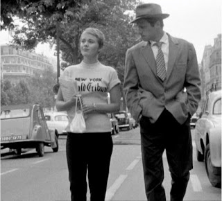
Because of American Settlers during the second world war, there was a fascination with American culture and particularly the 'Film Noir' genre. This American influence in new wave film further added to the very life like and honest approach as Film Noir focuses on crime and is set mostly on the streets of America. The characters in film noir also appear mostly in contemporary dress, speaking in a colloquial street manner, unlike many Hollywood actors who began their career on stage speaking with clear diction. We see the lead female actress in the new wave movie 'Breathless' dressing very casually, far from how we would have expect to see a Hollywood actor presented:
Jean-Paul Belmondo was also a famous new wave film actor who attempted to emulate an American film star, showing this great influence from American culture. He too stared in 'Breathless':
Jean Seberg (the actress above) even raised the question 'what is french culture'? It was believed by some that the french were taking on American culture to the point where was Americanisms being used in colloquial dialect such as the reference to 'la weekend'.
On the subject of the characters in new wave film, many of the protagonists were flawed, again challenging the Hollywood convention of the flawless hero. The new wave protagonists have been described as being aimless, stylish and sometimes acting silly. They could also be cowardly and sometimes amoral, and show mood shifts such as boredom and infatuation.
Considering the style of French new wave cinema, the approach to editing again challenged the Hollywood conventions. There are jump cuts, where sudden jumps to shots, which may seem irrelevant in relation to the current subject, surprise the viewer and evoke reflection on the shots meaning and place within the sequence. There are also points where you find sound and dialogue overlapping, where it is the actor outside of the frame who is actually speaking. There were also very stylistic references, such as the presence of characters wearing sunglasses. In new wave film sunglasses were seen as dividers from the rest of the world. They created a sense of distance, used mainly on characters who were being portrayed as either isolated or as celebrities, more powerful that the average person.
In context, it seems that French new wave cinema really broke the mould. Referring back to the auteur, there is a great sense of individuality and expressionism with the movement. This idea of resourcefulness and individual flare can really be applied to any area of film games and animation. The art direction also proves again that ideas are of equal importance to the money thrown at a feature. Many Hollywood movies display cutting edge visual effects, yet struggle to relate to the audience as the character development sometimes falls flat. The Film makers who shaped the new wave movement we're considered auteurs as a result of their unique approach to film making in an era where expensive Hollywood productions and A list actors and actresses were dominating the film industry. It is the commitment to produce a quality film with a low budget that still inspires independent filmmakers and most likely game designers and animators to produce successful work.
Tuesday, 6 December 2011
Online Networking

There are two main types of networking online: personal and professional. Sites such as 'Facebook' and 'Myspace', are used mainly for social networking and entertainment. These same sites however, can be used professionally, to promote new groups or share a band's music to establish fans and followers. The array of online networking sites online is huge. Sites like 'Flickr' and 'Slideshare' are used for sharing files along with the messenger 'Skype', which has a very fast file transfer speed. Sites like 'Linked' and 'Redbubble' are aimed at businesses trying to establish links with other businesses.
With the vast plane of online social networking sites, there comes controversy in certain areas. Seth Godin has spoken about what he considers to be 'fake networking.' This is the situation where an online user has thousands of friends who count as nothing more than a number. He speaks of how people try and build up a huge number of 'hits' or friends almost to be used as a trophy or a display of false popularity. Godin has spoken about how he has many friends who he could genuinely rely on and call upon for favours through networking relating to business. This is the kind of networking that can be beneficial, not the fake networking we can sometimes see on huge sites such 'Facebook'.
In a lecture on online networking, we were given a list of rules for good networking. This was relevant to us as the blogs we are producing over the period of our university courses are visible to the public. This means our Blogs are acting in essence as online portfolios, and how we network is a reflection on us within a professional context. The rules are: Be social, visit other logs, respond to comments, be generous, Subscribe by email, share, everything is permanent, know what you are posting about yourself, be a conduit, be original, create a news feed, credit sources, use key words, interview somebody, post frequently, beware widgets, left align, use paragraphs, don't copy paste from Microsoft word, stick with it and end with a question. These points will be taken in to consideration when I post work on my blog. It is important to convey professionalism and establish interest when blogging.
How to open a door
Here is my completed one minute instructional video:
I was not able to transport studio lighting to the film location, meaning I had to utilise natural lighting, along with a domestic desktop lamp. This actually gave some interesting results, combining a warm orange look with a complimentary soft cool blue. This is particularly clear in the first shot showing a close up of the confused subject. As I was acting in the video I was unable to man the camera, meaning most shots were taken on a tripod. This did however give a very tidy look, adding to the serious and efficient approach the video has taken on. I also improvised the voice over clips. This was an area I would approach differently if I was to reattempt the instructional video. Because I often paused the recording the very second I finished speaking, sometimes the sound cuts suddenly and sounds either harsh or incomplete.
Perhaps for future projects I could experiment with more controlled studio lighting and consider leaving time before and after sound recordings, making them easier to crop down without cutting off any sound or dialogue.
Storyboarding for instructional video
I began the process of working out shot framing for my instructional video by producing some rough sketches:

I was going for a very efficient approach, with bold and clear close-ups displaying the actions required to open a door. I had the idea for the lighting to be also very bold, lighting what is important to focus on within the video, planning also on keeping the background limited and empty to avoid distracting the viewer from the actual instructions. Here is the detailed final storyboard, considering how the cuts between frames will make each action being performed clear to the viewer.


I was going for a very efficient approach, with bold and clear close-ups displaying the actions required to open a door. I had the idea for the lighting to be also very bold, lighting what is important to focus on within the video, planning also on keeping the background limited and empty to avoid distracting the viewer from the actual instructions. Here is the detailed final storyboard, considering how the cuts between frames will make each action being performed clear to the viewer.

I have also included rough ideas for dialogue within the final storyboard. I have also attempted to display some ideas for lighting, and the actor's movements. The storyboard however, mainly has emphasis on shot framing.
Subscribe to:
Comments (Atom)