A game which really inspires me in the area of concept is 'Oddworld: Strangers Wrath.' Raymond Swanland was the man responsible for this, and his work also spans across previous Oddworld games. The thing I really love about the whole 'Stranger's wrath' concept, is that it takes a classic western approach, and applies it to a completely alien and fictional world. Many of the environments have a very familiar wild west desert feel, yet are inhabited by weird and wonderful creatures. Below is an example of one of Swanland's fantastic environments:
What I like about this image is the fusion of concepts. To the right, you can see small stone houses, similar to the small mexican stone houses that are sometimes seen in old western movies. To the left however, a very industrial looking landscape can be seen, more reminiscent of modern times. This combination of themes is done so very similarly in 'Blade runner' and also reflects my classic film noir/ science fiction concept.
Hi, my name is Andy Bailey and I am currently studying Digital film, Games and Animation at Leeds College of Art. I am primarily interest in conceptual art for games but I am also enjoying learning about various other medias (Film Production, 3D Modelling and Animation). Please feel free to comment and give feedback. Constructive criticism is much appreciated :)
Sunday, 30 October 2011
Thursday, 27 October 2011
John K. Couch Gag (Simpsons)
Check out John K.'s animation for the Simpsons opening couch sequence. John K. is the creator of 'Ren and Stimpy' and has a very crazy style of animating, and works with some bizarre and even morbid concepts. This is the reason I like him. He claimed that with this animation he wanted to completely move away from the rigid style of the Simpsons, and this resulted in a wacky almost surreal approach. Some of the subject matter is also very crude, e.g the way that Homer commands his wife to bring him a beer, reflective of feminist issues in earlier decades, and also how Homer ejects his brain resulting in him becoming slow and mentally impaired. This is clearly a very strange and daring approach being used by the well-loved 'Simpsons' series, which is the reason the animation is so exciting.
Syd Mead
As you can see through previous mood boards, the science fiction movie 'Blade Runner' has had an influence on my dingy future concept. Mead is a futurist designer and concept artist, who's website can be found via the following link: http://sydmead.com/v/11/
Interestingly, contrasting with his grim vision for 'Blade Runner,' Mead's work generally isn't so bleak. Lot's of his work has a great chrome look to it, very reflective and sparkling. He actually presents quite a clean flawless vision of the future in images such as this one:
Interestingly, contrasting with his grim vision for 'Blade Runner,' Mead's work generally isn't so bleak. Lot's of his work has a great chrome look to it, very reflective and sparkling. He actually presents quite a clean flawless vision of the future in images such as this one:
This image also demonstrates great one point perspective, which is relevant to my environment render. On top of this, the cool blue colour scheme contrasting with the yellow lighting in the distance, draws our eyes down what appears to be some kind of road for vehicles. The image is in no way flat and really invites us in to the scene. There is also just a touch of warm red to the left of the image, which adds balance to the painting.
Mead also had a background providing architectural renderings, which shows in highly detailed and accurate images such as this vision of a futuristic city.
Overall, I am captivated by Mead's highly detailed futuristic environments. His concept art spans across a great collection of films, some examples being Aliens (another personal favorite), and also Tron.
Tuesday, 18 October 2011
Adonihs.
I have always scanned the website Deviant Art for inspiration. One artist I have encountered numerous times during my searches is Adonihs. He produces highly detailed digital paintings of characters linked to film, game. His key skill is applying colour to concept art, for this reason he produces lots of collaborations. This piece is titled 'The Profile.'
Photo comparison
I was looking through some of my photographs take during my digital SLR induction, and I really quite liked the slow shutter speed shots. This particular photograph is my favorite:
The girl within the right third of the image is clearly the subject. She is almost fully in focus, whilst the car passing by has a great motion blur. This contrast almost draws you towards the girl and the bed of light green grass contrasts with her maroon jacket, adding further focus on the subject. Although it is the result of luck, the girl's shoes match the blue car in the backdrop, which along with the blurred darker blue car to the left of the girl, adds balance to the image.
After realizing my interest in slow shutter speed photography, I managed to find the photographer Erick Loitiere's flicker page. This image 'Rain is coming,' really caught my attention:
Animation
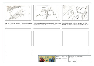
Referring back to my storyboard, here is the flip book animation I have produced. The timeline is:
1. The interrogation victim turns to investigate his surroundings.
2. Almost instantaneously after, Bob smashes his hands down through the table in front of the victim to cause a startle.
3. Bob grabs the victim by his shirt and holds up his fist to intimidate him.
I am fairly happy with the animation, however (although I did want the action to be fast paced), The few frames and long sequence make the animation very snappy and hard to follow. Also, I had to slow down the frame rate so that the events didn't fly by in a second, making the motions somewhat jerky.
Steamboat Willie
While studying the fundamentals of animation, we looked at this classic Disney animation. I was really impressed with how many fundamentals were present in this 1920's animation which all of which are still applied today. We can see a great example of squash and stretch at 0:19 with the cylinders on the ship shooting out steam. There is also a good example of anticipation at 1:38 where the steamboat captain opens his mouth to take a bite out of his tobacco. Overall these elements make the animation very slick and dynamic, also offering humor with the over exaggerated movements.
Lighting induction
It was really fun experimenting with lighting when using the digital SLR. I chose to photograph my harmonica, as I thought that the smooth reflective surface of the instrument would help emphasize the intensity of the lighting. Here are some of the more sucessful photographs taken:
Thursday, 13 October 2011
Digital SLR induction.
During a recent photography induction, we were taught how to use a 'single lens reflex' camera. Bellow are examples of me experimenting with the ISO, shutter speed and aperture to achieve a variety of images. I also opted to use manual focus to give me more control over the depth of field in my images:
Bob's Dingy Bar
I have drawn up the Bar environment for Bob to inhabit. Here I was really experimenting with colour, using Neon lighting and lighting coming in from the streets outside. The scene itself is very dark and grim, the bright neon lights making the Bar look tacky and run down:
I believe that this environment really works with my character, as Bob is very anti-social and also a recluse. The Bar is very dark and lonely, Bob heads here not to socialize, but to drink and think to himself.
I believe that this environment really works with my character, as Bob is very anti-social and also a recluse. The Bar is very dark and lonely, Bob heads here not to socialize, but to drink and think to himself.
Tuesday, 11 October 2011
Bar Blue Print
I have produced a blue print of the Bar where Bob is often found drinking away his insecurities. The Bar is a very run-down unwelcoming place, where few exchange words. Bellow is the plan:
Ron Cobb
Ron Cobb was a concept artist responsible for creating many of the human elements in the 1979 film 'Alien.' I was always a fan of the dirty spaceship look in the original Alien movie, and the idea of taking a different direction away from the clean and polished sci-fi look. Some areas of the ship look very industrial and bleak, in contrast with some of the white clean padded hallways. Here is one of Cobb's dingy corridors, relating strongly to the run down futuristic approach I envision for my Bar environment:
Environment Moodboard
I plan on creating an old dingy bar for Bob to inhabbit. Here is a moodboard I produced to provide me with inspiration. It contains both bar related images (stools, spirits) and science fiction environments to give my bar a futuristic edge:
Mathias Verhasselt
As I am beginning to design an environment for Bob, I searched for some examples of this area of concept art. I managed to find this great French artist, who creates lots on game environment concept art.
He is primarily a speed painter, and manages to capture mood and ambiance in his digital work through his use of colour. I like his level of detail and how his work really draws you in. His paintings are so intricate that you can almost place yourself inside of them. Bellow is a link to his 'ConceptArt.org' profile:http://www.conceptart.org/?artist=m%40.
Bob Turnaround
Here is the full design of Bob. I have given him Gorilla-like proportions, with a large broad upper body and short legs to make him appear like a real brute. Although his legs appear short, overall (due to his enormous build) Bob still reaches a height of 6ft 3 and is very intimidating. I like the technique of using grey and white shading on multiply/ overlay layers to produce shadows and highlights. Because my concept has a film noir approach to it, The colours are very washed out and bleak with this black and grey style of working. I would however, like to experiment with more dynamic colours and consider some colour theory. Hopefully I will have time to go back and add some dynamic shadows and highlights to some of my previous designs to expand on my knowledge of colour.
Character Sheets
Here are my character sheets which I realised I'd forgoten to post here. My first sheet reflects my initial take on Bob as an average man caught up in the action. The second sheet improves on this idea and reflects Bob as a flawed ageing detective.
Tuesday, 4 October 2011
Storyboard
As I am beginning to animate Bob, I have produced a storyboard which reflects the previous interrogation concept. I am currently producing a flip book animation based on this storyboard, which I hope to display on here soon.
Environment (Photoshop Induction)
We also recently had a Photoshop induction where we were asked to produce an environment by digitally editing a compilation of images. With my scene I went for a surreal approach, even incorporating a man flying by on a jet powered hang-glider, which also allowed me to experiment with the motion blur filter. I enjoyed trying to get the shadows of the buildings accurate and trying to create realism through considering depth of filed (e.g the buildings being a cool blue, out of focus in the distance.)
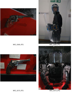
Royal Armouries Visit
Saturday, 1 October 2011
Moodboard.
Here is the mood board I created to inspire some of my concepts. I plan on extracting some of the street light colours to give a kind of urban feel very much like the movie "Blade Runner," which also carries a science fiction/ film noir theme.
Subscribe to:
Posts (Atom)


